Froot - Graphic Design Fake Ad Campaign
My Pitch
"The animation that I am going to designing for you, FROOT, an animated story about the journey in creating a FROOT drink. This animation will be used to engage and draw in potential new customers. These customers will have an interest in enjoying fruit drinks and either regularly consuming them or enjoy one every now and then. I have chosen to use simple graphics and eye candy colours to give the animation a familiar yet eye catching look, also this makes it much easier to animate, adding room for additional animations assisting the project to hit its goal of marketing the FROOT drink. Another design choice I have gone with is to reduce typography to add room for animation to elevate and move the story along. The animation will also contain many cuts to new scenes to ensure the viewer stays engaged with the animation as long and slow scenes will be less effective in engaging people than short, especially while being viewed on an Instagram story, as show with the rise of short for content and its impact on the world."
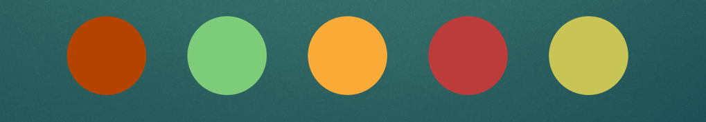
These are the house colours that matched the brief given to me, and make up the primary colouring of the animation.
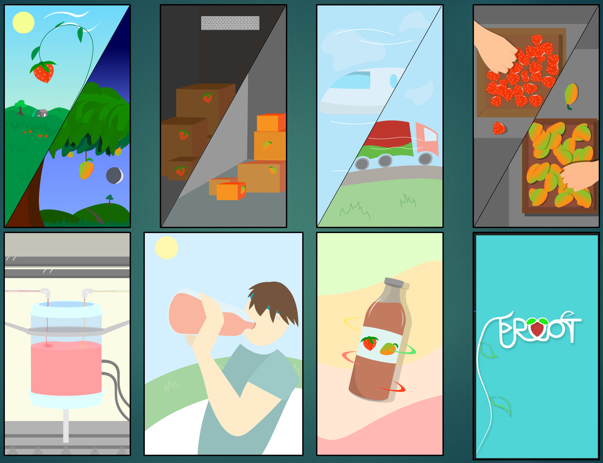
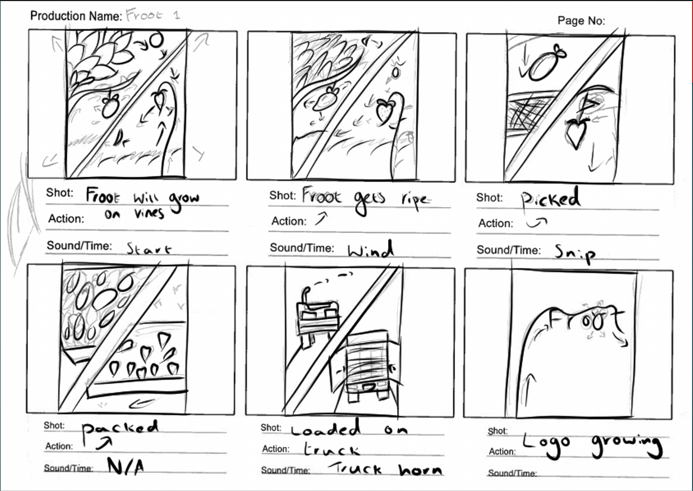
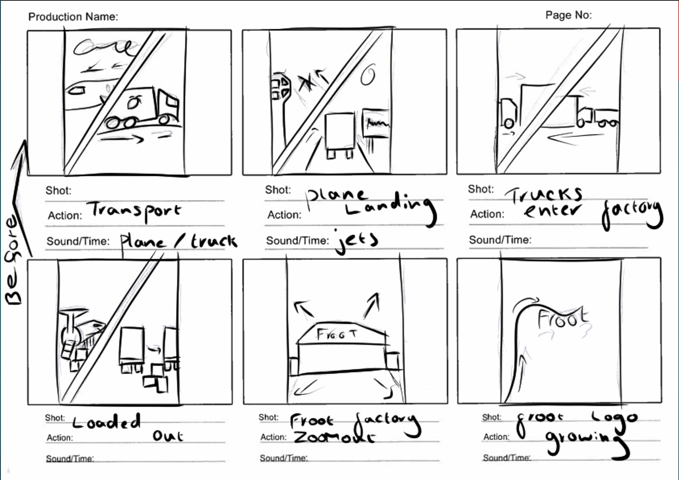
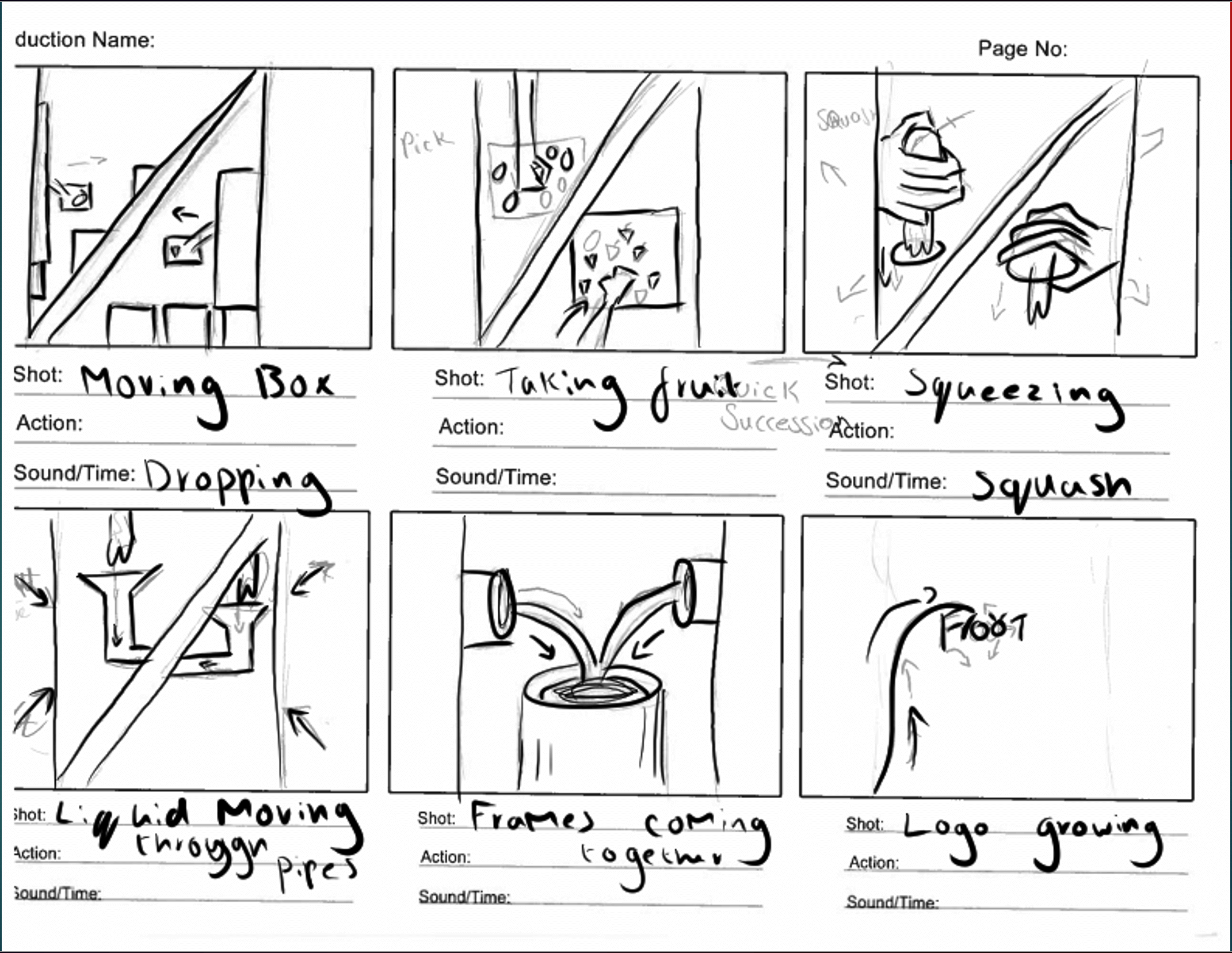
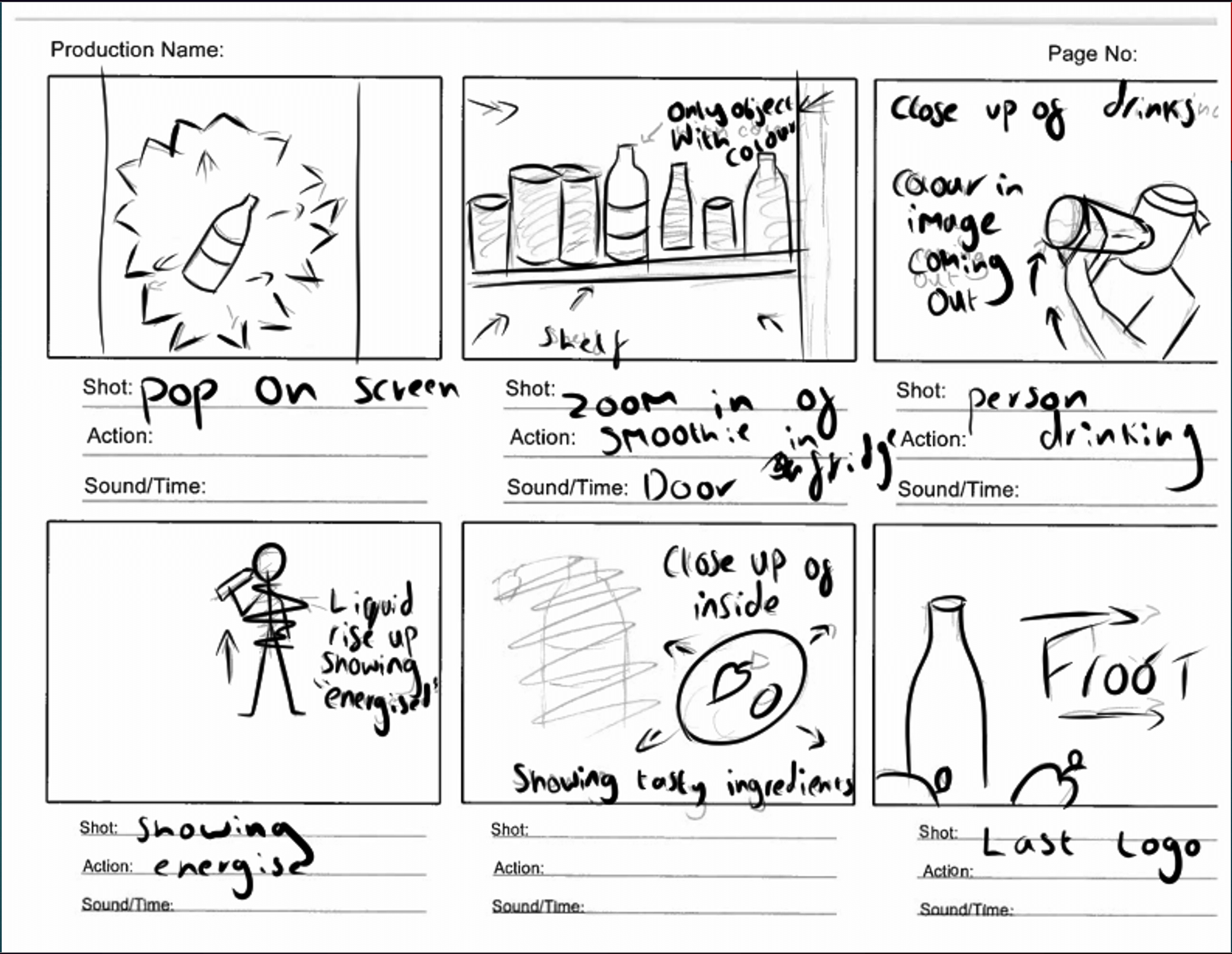
Here are moch-ups of the Direction and Look of the animation.
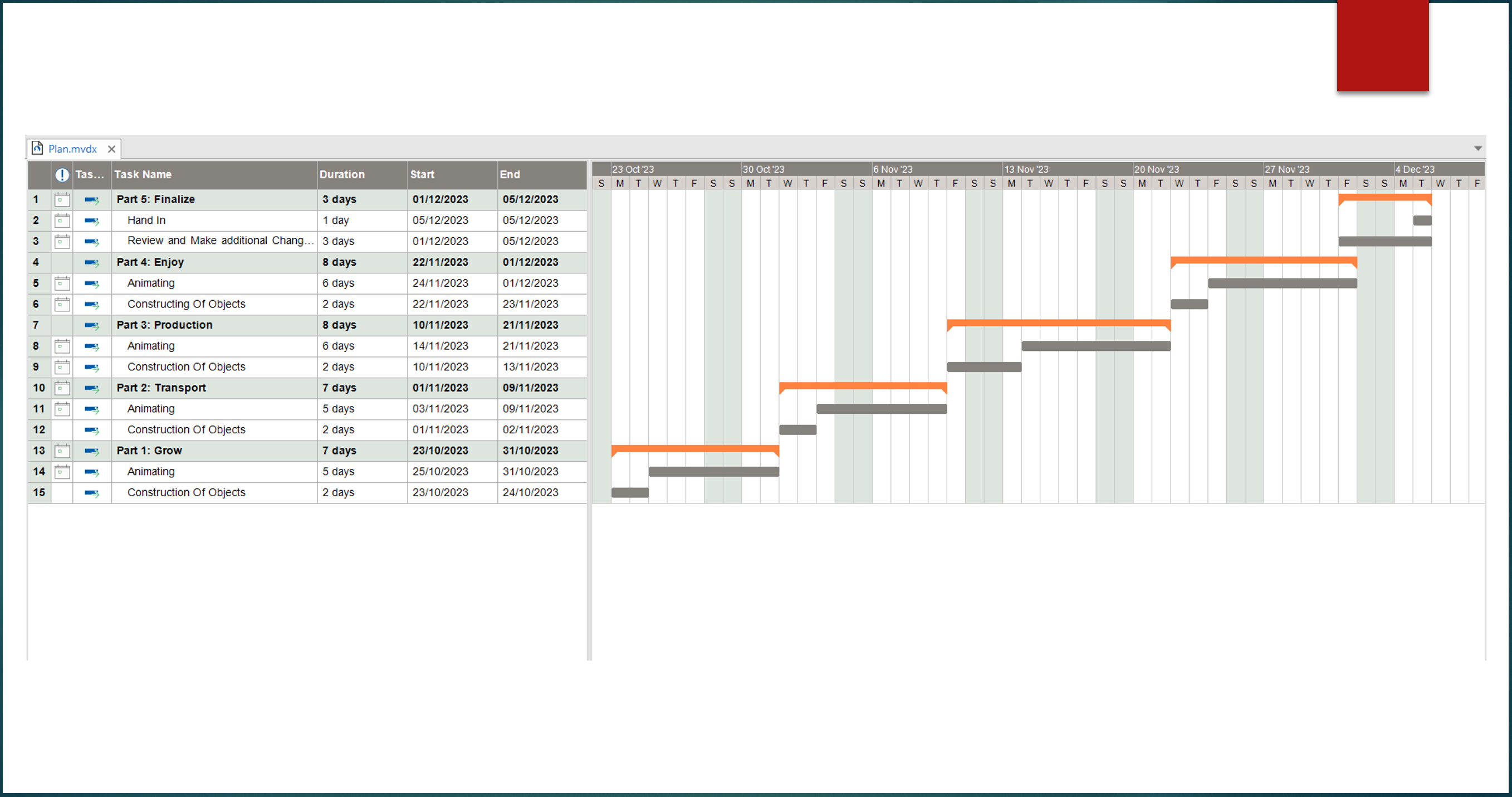
I gave the Fake Client a time scale and how how my time will be used in the creation of the Animations.
Finale: